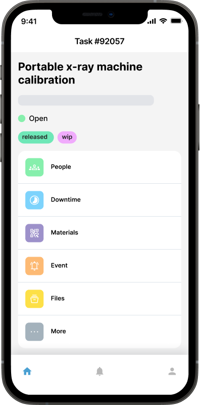
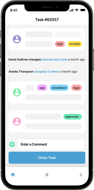
Introducing Maintainly’s Brand-New UI: Faster, Cleaner, and Built for the Future
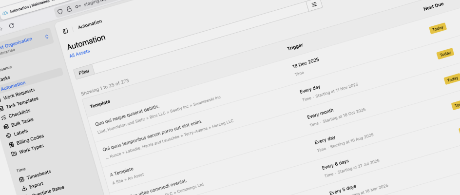
After months of research, design, and engineering, we’re excited to introduce Maintainly’s brand-new user interface, a major step forward in how teams interact with their maintenance data every day.
This isn't just a visual refresh. It's a ground-up upgrade to create a faster, clearer, and more scalable experience for every user, whether you’re managing a single site or coordinating maintenance across hundreds of assets.
Why We Upgraded the UI
1. To support the way modern maintenance teams work
Maintenance operations have changed dramatically in the last few years. Teams today move faster, rely on richer data, and need flexibility from their software, not friction.
Our old UI served thousands of users well, but it was built on patterns that had gradually reached their limits. Screens were becoming more complex, workflows needed to be streamlined, and performance expectations had risen. We also needed more screen real estate :)
The new interface reflects how maintainers actually work in 2026 and beyond: a mobile-first approach, desktop-efficient when doing deep work, and visually organized for quick decision-making.
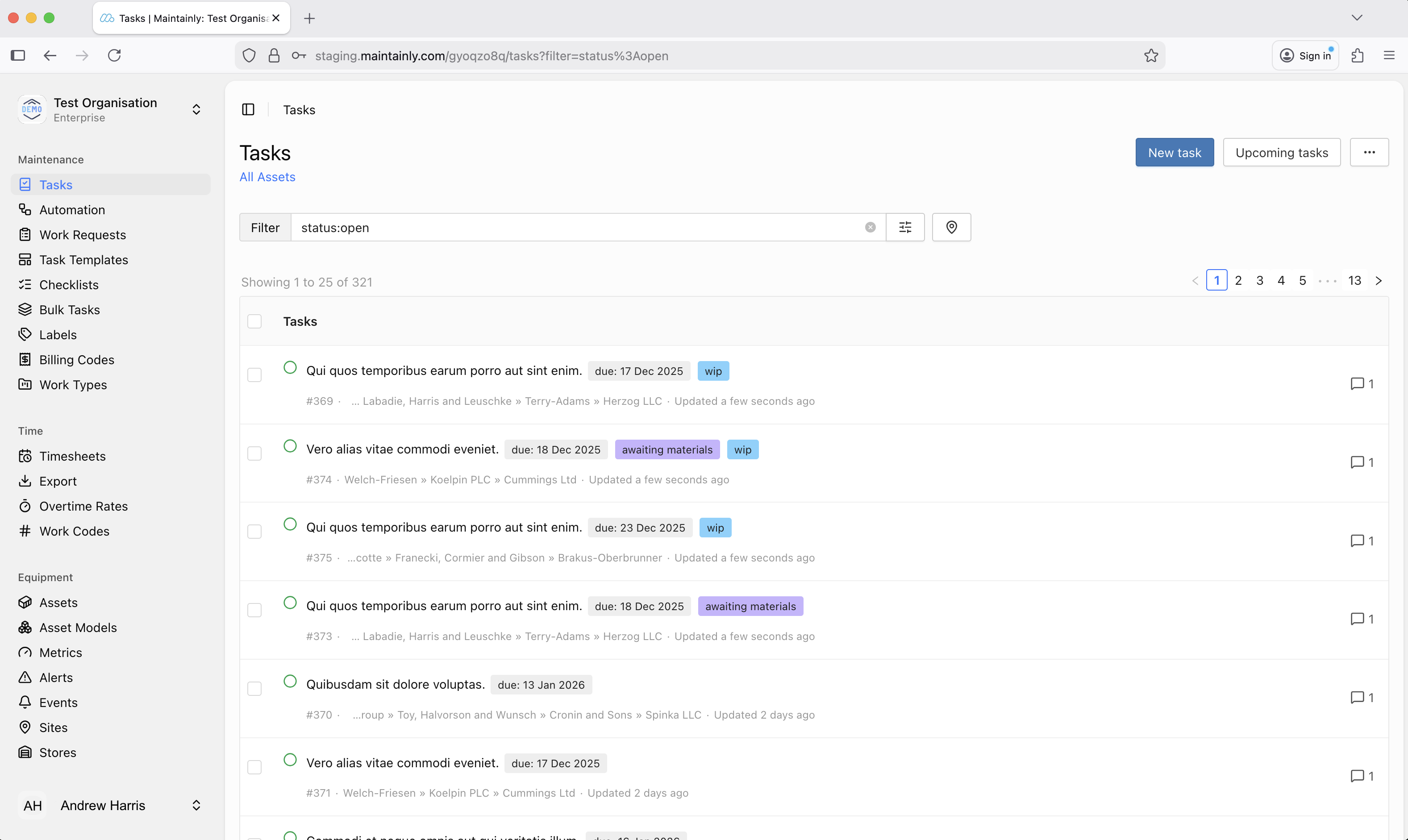 2. To reduce cognitive load
We heard a consistent message from customers: “We love the features, but make it even easier to find exactly what we need.”
So we focused on:
Clearer navigation
More intuitive grouping of tools
Cleaner visual hierarchy
A consistent layout from page to page
The result: You move faster because the platform gets out of your way.
3. To create a better design foundation for the long-term
Maintainly’s roadmap is packed with new capabilities in automation, analytics, and inventory management and AI features. But the old front-end structure has been severely limiting how quickly we can deliver them. And that's unacceptable.
The new UI gives us:
A modern, scalable design system
Flexible layouts for richer data visualizations
Cleaner component architecture (so future updates won’t disrupt your workflow)
This upgrade isn’t just about the present; it’s about enabling a much more powerful platform in the future on which we can bring you more features.
What’s Better Today: Usability Improvements You’ll Feel Immediately
Faster navigation
A streamlined sidebar, improved search, and fewer clicks to reach high-value screens mean less time hunting for information.
Cleaner, more readable layouts
We redesigned typography, spacing, and color usage to highlight what matters most: open work orders, overdue tasks, inventory counts, meter readings, and more.
Better responsiveness
Whether you’re at a workstation or on a factory floor tablet (using a browser instead of the mobile app), the UI adapts to your context without sacrificing clarity. Also, those users who currently enter their timesheet data via a browser on their mobile device will benefit greatly.
Accessibility upgrades
Contrast, keyboard navigation, and screen-reader support have all improved because high-quality maintenance shouldn’t depend on perfect eyesight or pointing precision.
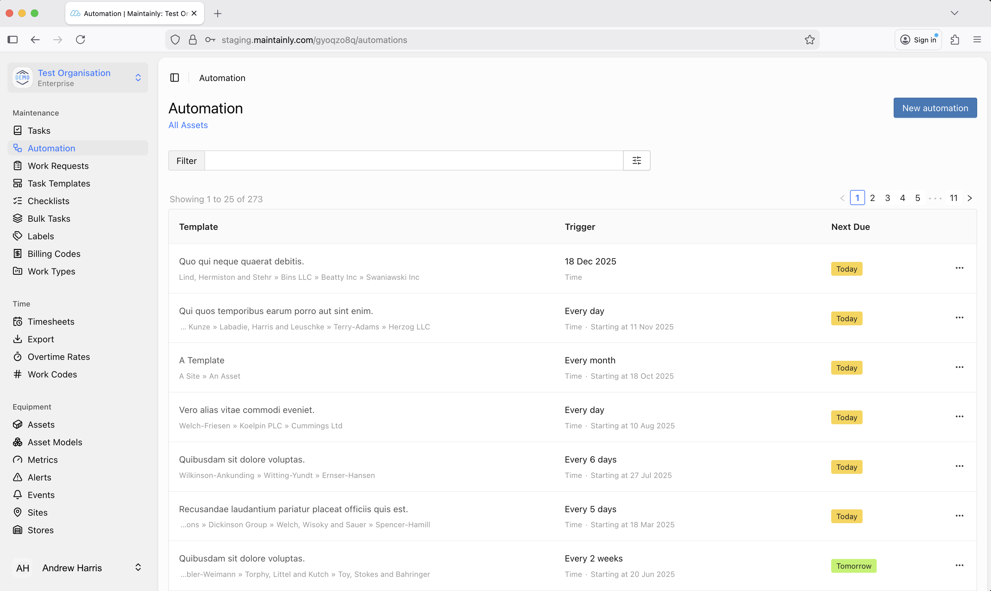 Built for the Future: What This Upgrade Unlocks
The biggest wins of this new UI are the foundations it sets. The rebuilt interface allows us to deliver features that were previously difficult or impossible.
Here’s a preview of what this enables:
Richer analytics dashboards
More advanced charts, clearer trend views, and customizable reporting deliver deeper insights with less visual clutter.Workflow automation tools
Build and visualize automated rules, enabled by the new UI foundation.
Improved multi-site management
New capabilities to manage assets, schedules, and reporting across multiple locations, all supported by a more flexible interface.More modular inventory and purchasing tools
Expanded parts catalogs, better vendor visibility, streamlined purchasing workflows, and improved barcode interactions.Faster iteration on user feedback
Quicker delivery of improvements, UI options, and customer-requested features without disruptive, large-scale releases.
A UI that grows with you
This redesign represents a major milestone for Maintainly, but it’s only the beginning. Our goal is simple: deliver the cleanest, fastest, and most intuitive maintenance management experience available.
With this new UI, we can move even faster, build even smarter, and ship features that help you get more done with less effort.
We can’t wait for you to explore it.
If you have feedback, we’d love to hear it, this upgrade was shaped by our users, and the next evolution will be too.
Further Reading

What is CMMS?
A Computerized Maintenance Management System (CMMS) is a software solution that streamlines and automates maintenance management processes, including work orders, preventive maintenance, asset tracking, and inventory management, to optimize the efficiency and performance of organizational assets. But let's dig into the details...
Read more →
Benefits of CMMS
CMMS will aid and inform technicians out in the field, as well as decision makers, on maintenance work that has been done, will be done soon, or is planned to be done in the future. Broadly speaking, the benefits of CMMS can be broken down into three categories: management; visibility; and cost control.
Read more →
What is the 75% Maintenance Rule in Asset Management: When to Repair or Replace
What exactly is the 75% maintenance rule, how is it applied, and why should it be integrated into your Computerized Maintenance Management System (CMMS)?
Read more →